May - Week 2
Written 15/05/2025, Updated 16/05/2025
Sketches based on her work
This month, I decided to go back to what I did Jan-March and copied some of her work with a felt tip pen to get the 'feel', I definitely got the feeling of needing to leave more space!
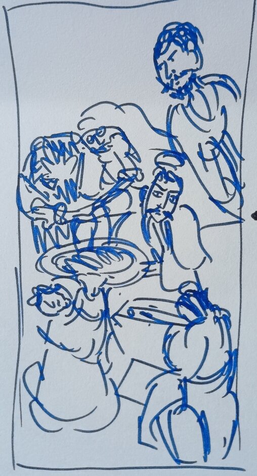
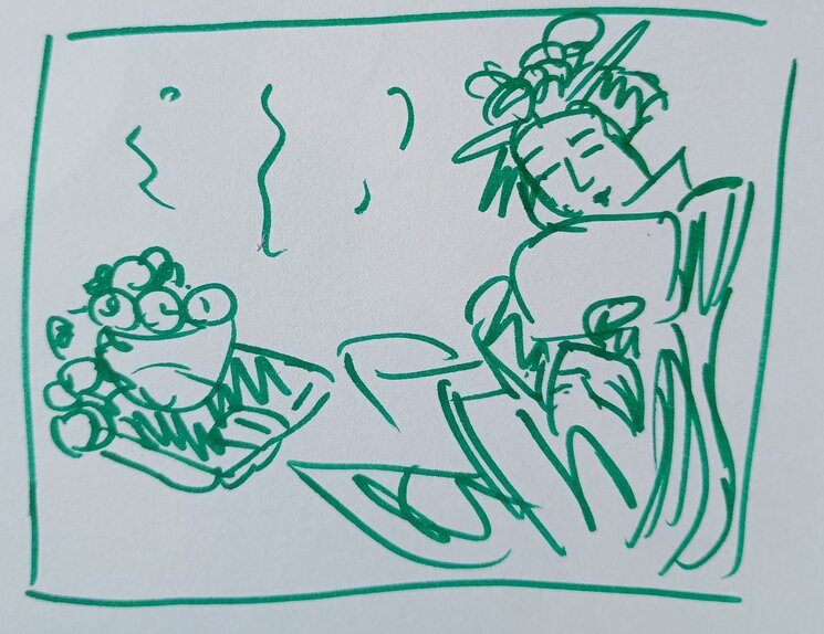
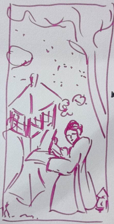
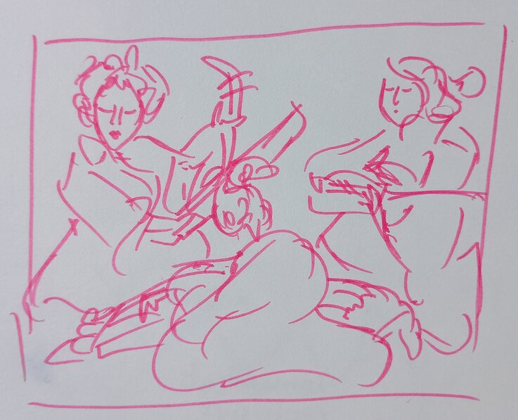
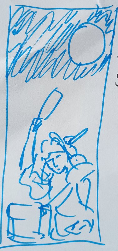
In general, I noticed that she tended to use a lot of shadows in her more 'environmental' pieces, and that people (especially women) are very central in all of her works. But that something is happening, in 'motion' (even if sat down). There is also a lot of space (negative space?) between different subjects (human or otherwise) in her pieces but simultaneously things/people will overlap with makes them somehow more naturlistic depsite their 'floating' nature.
Specific artwork I will be focusing on
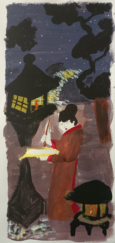
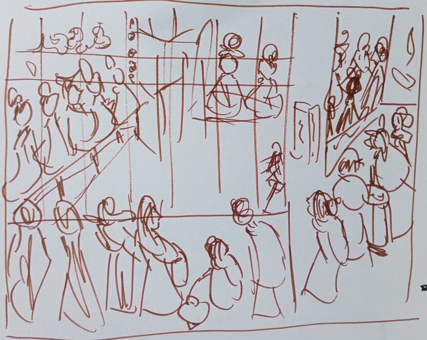
Beauty Viewing Cherry Blossoms At Night, 1850.
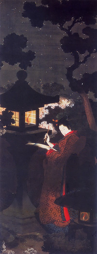
Why this one?
I must admit that before this month started that my plan had been to take inspiration from Night Scene in the Yoshiwara which is a very stunning artwork. However, after researching Eijo more and finding some of her other work I ended up REALLY liking this one - the way it is so shrouded in shadows with the small glowing lights and the way the red slit of her dress almost glows itself contrasting with the darkness of the rest of the painting.
(I must also admit that Night Scene in the Yoshiwara looked way too complex for a fairly inexperienced artist like myself to do an artwork based on it in less than a month (maybe that's a cop out but I am ultimately doing this for fun more than anything else!)
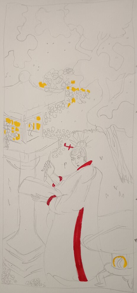
Sketches based on specific artwork
Similar to what I did in February, I did a pencil drawing of the artwork and then I did a quick painting of it too to get a rough basis of colours.