July - Week 2
Written 14/07/2025, Updated 15/07/2025
Sketches based on her work
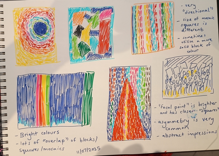
Since Alma Thomas's paintings were abstract, with less defined 'shapes' and were heavily focused on the colours I did something slightly different and I did mini copies of her paintings in felt tip rather than 'sketching' them per se like I normally do (besides her March on Washington, but that was an exception in this case).

I think that this approach helped me appreciate how dense in colour her work really is as well as her use of directions to draw the eye. As I noted down in the drawing:
- Her work has a lot of bright colours
- There is some "overlap" of blocks/squares/mosaics
- Her art is very "directional" (the squares/lines "point" in a certain way the eye follows)
- The size of the mosaic squares is all different
- Sometimes her mosaics utilise a more solid block of colour for effect
- Her focal point will have denser squares to show a more saturated colour
- Asymmetry is VERY common in her work
- Her work is abstract impressions (but I suppose this was obvious already)
Specific artwork I will be focusing on
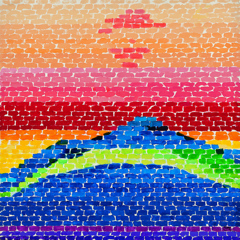
Apollo "12 Splash Down", 1970.

Why this one?
I will admit, I saw this painting while looking through Alma's work and it immediately inspired me. I live in the Welsh valleys so there are a lot of hills all around me and this picture in particular really made me think of my home. So I want to take this painting and use it as inspiration to represent my home. I'm not even sure if she intended for it to be a mountain, but that was what I saw in it so it's what I will be taking from it :)
Sketches based on specific artwork
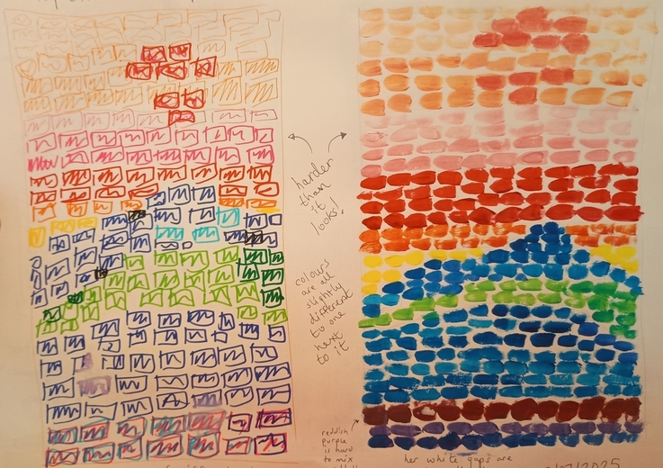
This month, I decided to focus on the colour aspect of the piece and do a copy with felt tip and then do a painted copy with acrylic paint.

As you can see, I very much underestimated how close her squares really are from eachother - they are very tightly packed! But I also neglected to truly consider the shape of her subject. Alma Thomas would draw her backgrounds before applying paint which I hadn't considered necessary if I'm just copying the abstract paintings surely? Well I was wrong! The shape matters a LOT!
I also didn't have enough colour variation, which gives her pieces so much visual flair and interest (but I was doing this relatively quickly to be fair).
Something else I neglected to really consider was that she had consistend straight lines with the shapes coming from the colours whereas I started with the shapes and not the lines which made my copy look a lot 'messier' than her original. (Also reddish purple is SO HARD to mix well, at least with my crappy acrylic paint!)
This is all stuff I shall be considering over the next few weeks!