July - Week 4
Written 27/07/2025
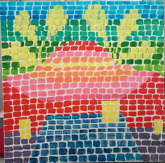
Final piece!
View From My Front Door

The theme
The theme I guess was seeing the beauty of my surroundings, I definitely have more of an appreciation of the massive hill I see pretty much wherever I go in the village I live in.
Thoughts on the process
The process was really fun! Sitting outside drawing, thinking of the colours and then painting the canvas were all really enjoyable for me! (I actually finished before the end of the month for once!!!)
As you can seehere,I didn't need to layer much at all (only at the end with the clouds), so there was a nice rhythm to my painting -- I started at the top and worked my way down!
I think the art style being very flat, with solid colours meant that I didn't need to worry about depth or perspective in a way that I normally do so I could just roll with whatever I did without stressing too much. And I think because Alma's work itself wasn't perfectly 'refined' (she would keep in the pencil marks even on her final paintings) that really took the pressure off of me to be like that as well.
Specifically in regards to the painting part, just painting coloured squares is SO relaxing! Since I had already planned out which colours went where I just mixed up the colours and went with the flow. It was so fun that my partner mentioned that they would like to try it too (something they have NOT done with any of my other projects!)
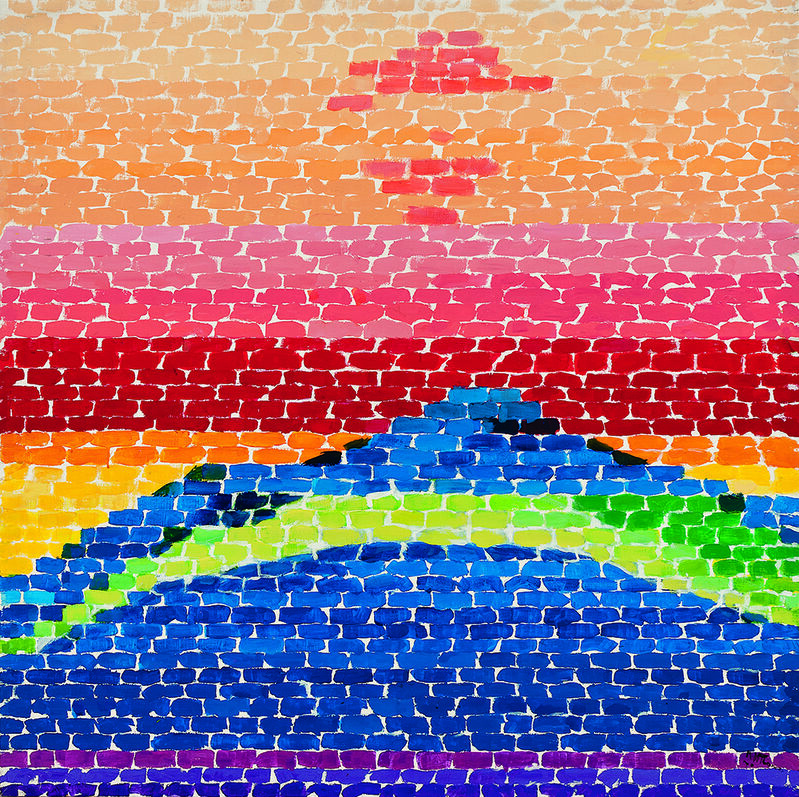
Comparison with inspiration


Now, in my defence my phone camera sucks and IRL the painting is more vibrant... honestly I think the main thing my painting is lacking is that I should have made the squares smaller (and been less caught up on them being squares - my white gaps are definitely too big! And I was conciously trying to NOT have them be too big! It's seriously harder than it looks!)
That said, I am actually happy with this. It really feels like something where I took inspiration from Alma Thomas but made something of my own based on something personal/local to me. When the artist in question has such a distinctive style that probably makes that part easier XD
I think if I were to do this again I would have played more with shading, as while Alma Thomas's work is mostly flat she does still include some 'shading' to add more dynamism to her work.
But for a first attempt of the style, I think I did pretty well :) I may indeed try doing this at some point in the future for my own enjoyment!