July - Week 3
Written 20/07/2025
Sketching ideas
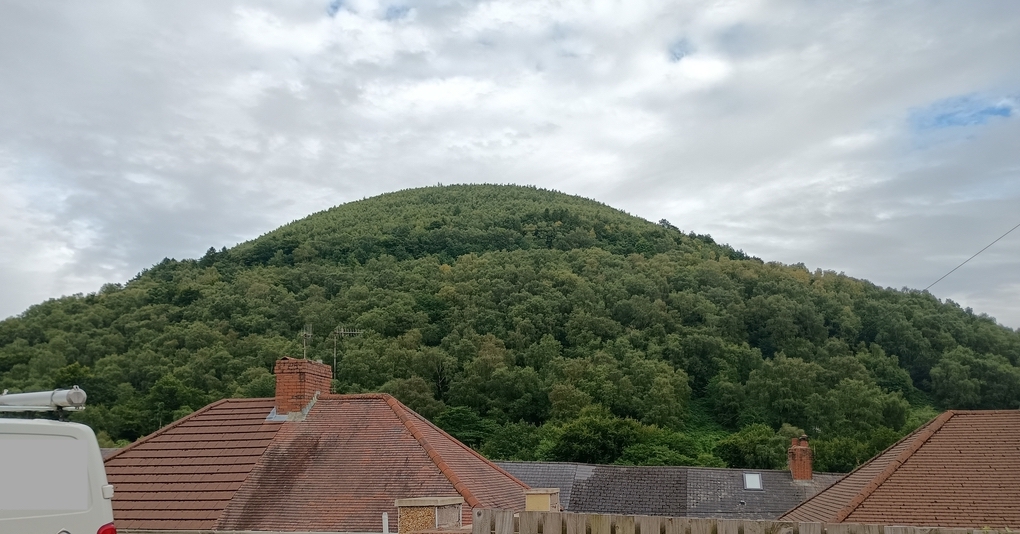
So, as I briefly mentioned last week (but not in that much detail), my plans for this month are to do a painting that represents my home village (meaning where I currently live). So right outside my house there is a view of a massive hill (it isn't a mountain though, it isn't quite big enough for that). Here's a photo I took (hopefully it isn't TOO identifying, I did have to censor the van since it had an address on it).
Since I will be representing something that is literally on my front door step, I decided to do some sketches from life rather than from my photo. I will say drawing in my A3 sketchbook on my lap was a rather precarious experience and not the most comfortable - I should have dragged a side table out with me in hindsight!
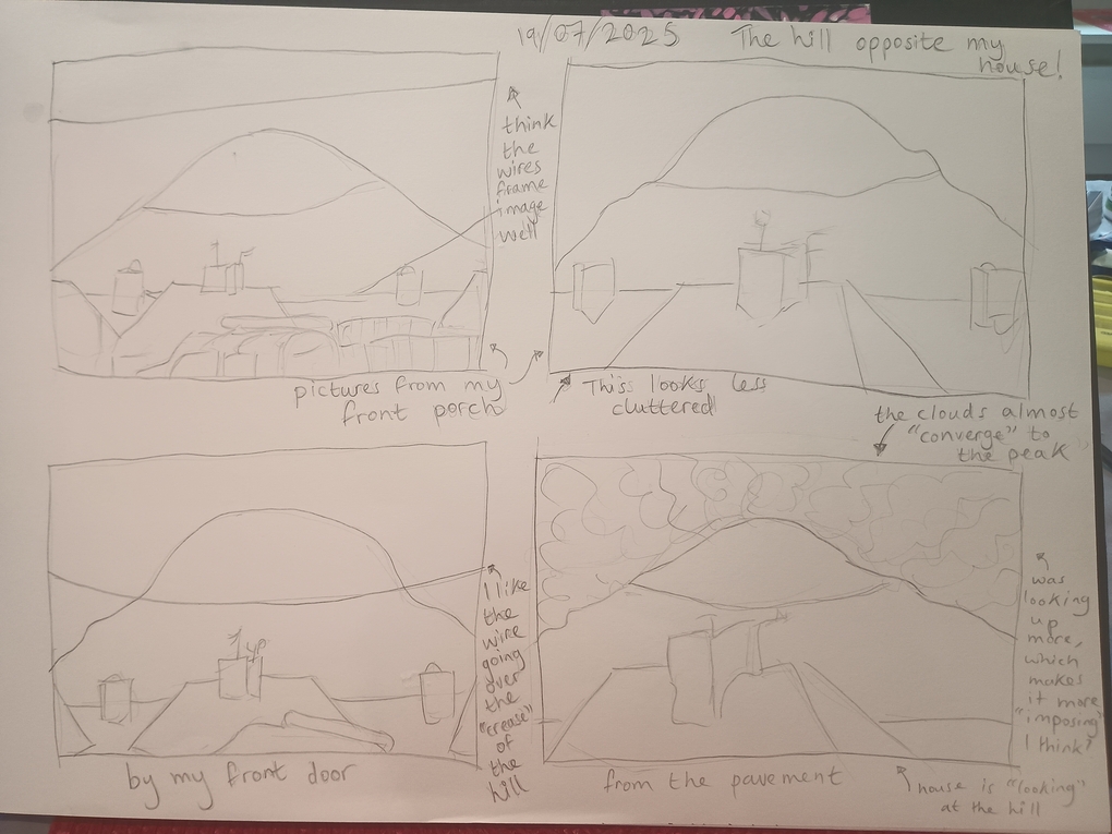
My key takeaways from this exercise were:
- The surrounding phone cables (not visible in the photo) framed the image well
- Only three houes for the foreground, otherwise it looks too cluttered
- The clouds 'converging' to the peak - or the crease - helps with drawing the eye to the hill (the main focal point)
From these sketches, I then drew a "composite" sketch of the things I liked the most from my practise.
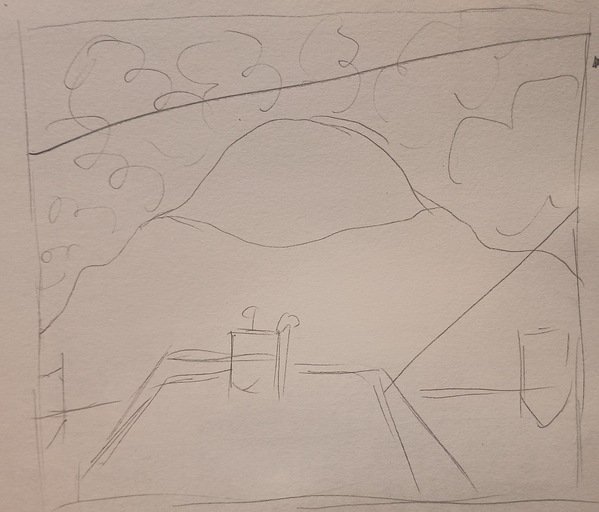
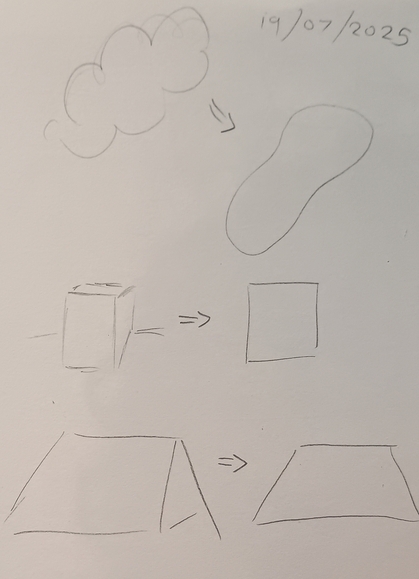
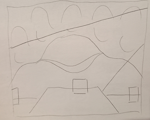
As we should know by now, Alma Thomas was an abstract/impressionist painter. So she tended to focus on simple, 2D shapes. While the above sketch is fairly streamlined already, I thought it needed MORE simplifying - to ensure the shapes were all 2 dimensional. So I practised that and then redrew the above picture but EVEN SIMPLER!
Once I had finalised the 'shape' of my final piece, I needed to focus on the part that actually makes Alma Thomas's art hers; the colours! I did four practise pieces, experimenting with different colours using watercolours. Which is something Alma herself actually did as you can see here with her draft of 'Blast Off' (with the final version as a comparison):
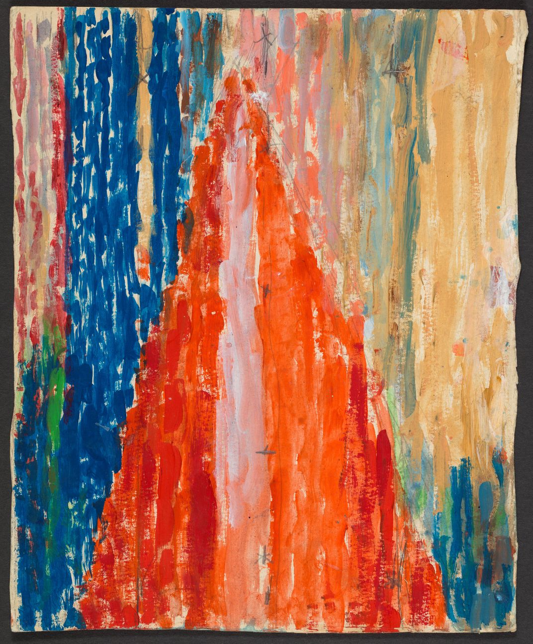
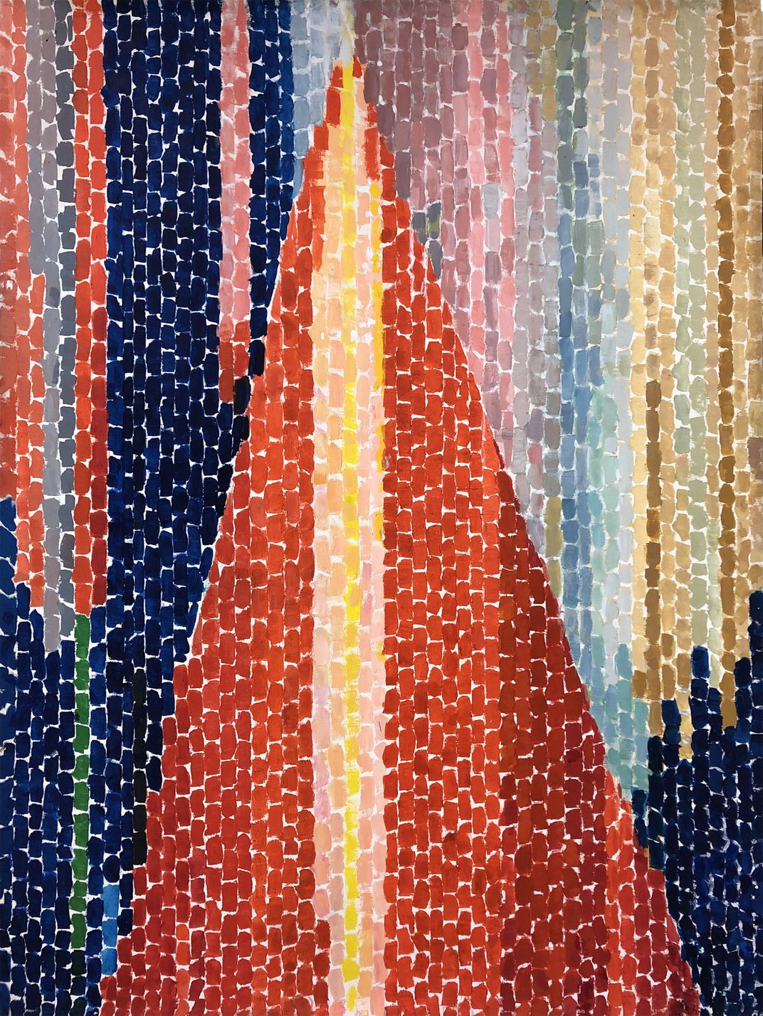
It is interesting to note how much 'looser' the watercolour draft is compared to her controlled final piece (but also the colours are less vibrant which makes sense with watercolour vs acrylic). But anyway, here are my four initial painted practise pieces:
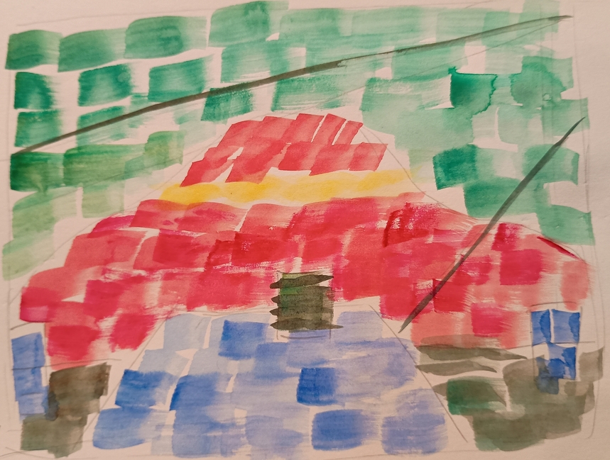
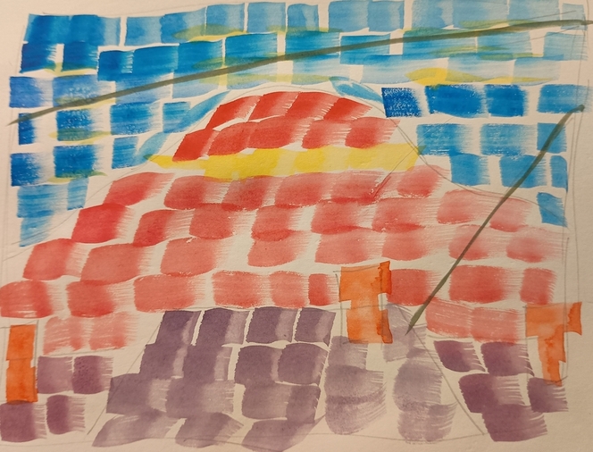
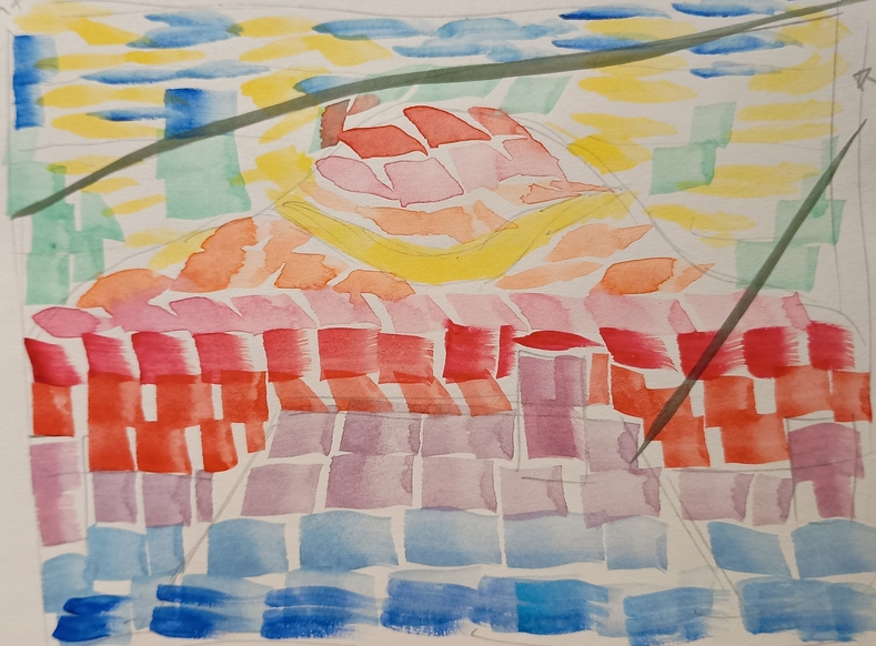
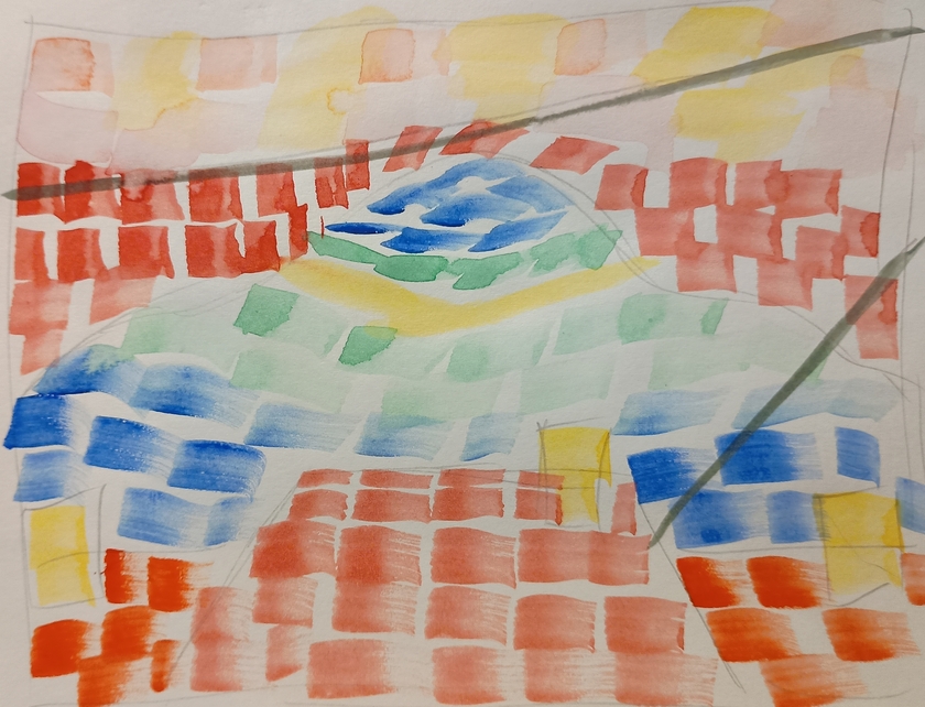
So after doing these four sketches, like with the pencil sketches I decided to almagamate the parts I think worked best into a singular idea, before painting it out I actually did a little pencil sketch of the vision so that I didn't just slap the colours down (which I may have done before in the past!)
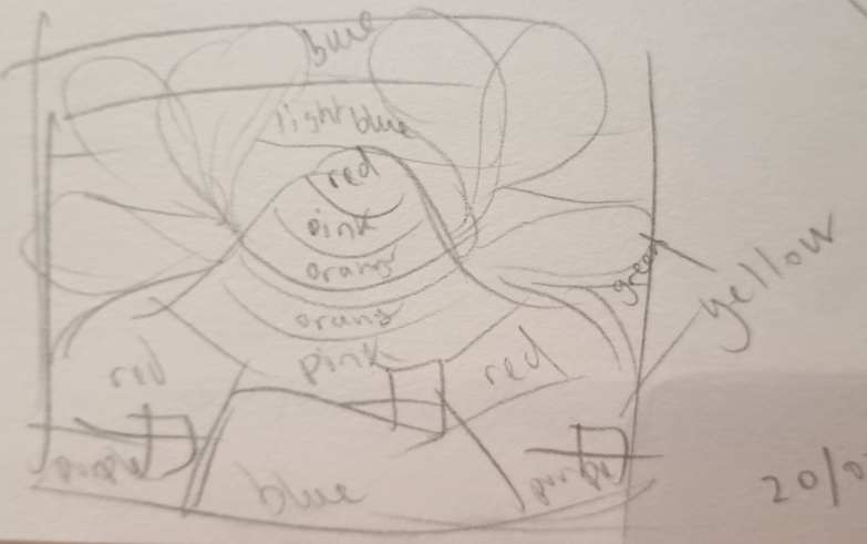
So here is the final plan for my July artwork
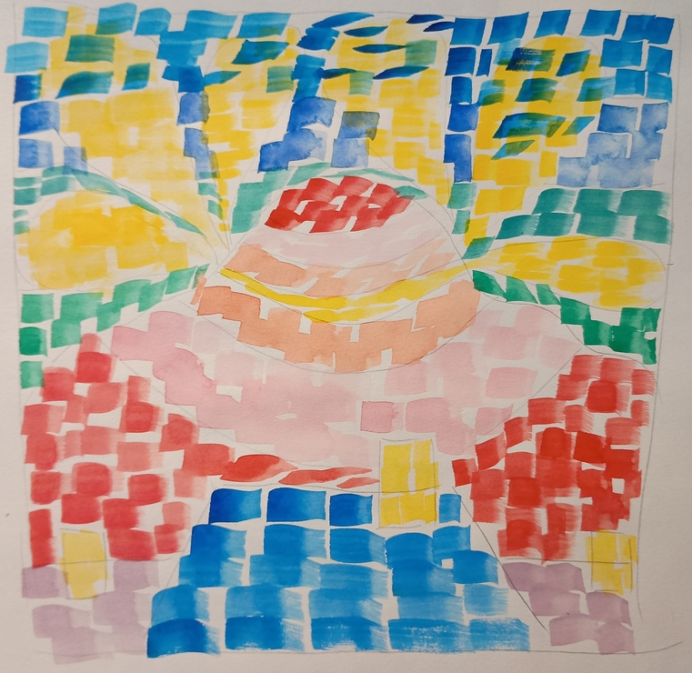
Some thoughts I noted down
- The colours will be more saturated in the final painting (acrylic painting will inherently make that easier)
- Not sure if the wires should be small squares or solid lines (or if they are really needed, I only realise I forgot to add them in now!)
- In the final painting I will make sure each square has slight differences in colour like how Alma Thomas's mosaic like paintings do
- I hope the eye is drawing to the centre of the piece (the hill)
- The clouds will be more like the moon is shaped in Splash Down, rather than the blobs I have depicted here
How the process is going
I feel like things have been pretty on track so far? I have a solid 11 days until the end of the month to get the final painting done and I think that because the style is more abstract I am feeling less pressure to make sure everything looks 'correct' (not that I think this piece will be 'easier' by any means! Just from practising I can see that I really will need patience to get the really controlled, strong look that Alma Thomas achieved in her works).
Anything I have learnt
I have learnt the usefulness of redrawing something several times over to get a good 'feel' for it, even if it is a little bit tedious. I can't really think of much else for this week/month tbh.