August - Week 2
Written 17/08/2025
Sketches based on her work
The Sketches basaed on her paintings were very interesting to do, considering how varied her art is. I do think I didn't leave enough space in them (I was focusing on the forms rather than the whole composition)

I feel like a common theme amongst her work was the aspect of things/people being caught 'in the moment' (collecting food, dancing, sitting etc) and also her cultural heritage (traditions from the Muscogee Creek/Cherokee nations but also the environment). I also noticed that either the sun or the moon feature heavily (or in the backgrounds) of her paintings. She also tended to have limited colour palettes (not mono-coloured but definitely only a slice of the colour spectrum) but her work is still vibrant!
Specific artwork I will be focusing on
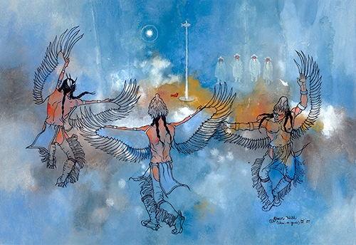
Spirit of the Suli Obanga (Buzzard Dance), 2007.
Why this one?
Funnily enough, when I first decided to do Joan Hill for this project the painting that I was going to take experience from is Effigy Bowl of the Sacred Fire since I thought it looked SO beautiful. But as I did more research, and when I started drawing the sketches I found that Buzzard Dance really gave me good inspiration for what my final idea for this month will be.
I love the fluidity of the dancing in Buzzard Dance, and the contrast of the inked men and the white 'ghostly' men in background. I also really like the watercolour wash for the majority of the colour in this painting, it gives a good 'feeling' or 'impression' of the piece. I think that not colouring in the clothes lets the ink details stand out more (or maybe I'm biased because I find I lose detail when I colour in drawings).
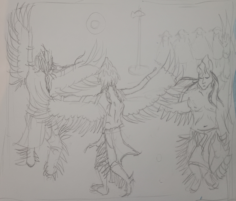
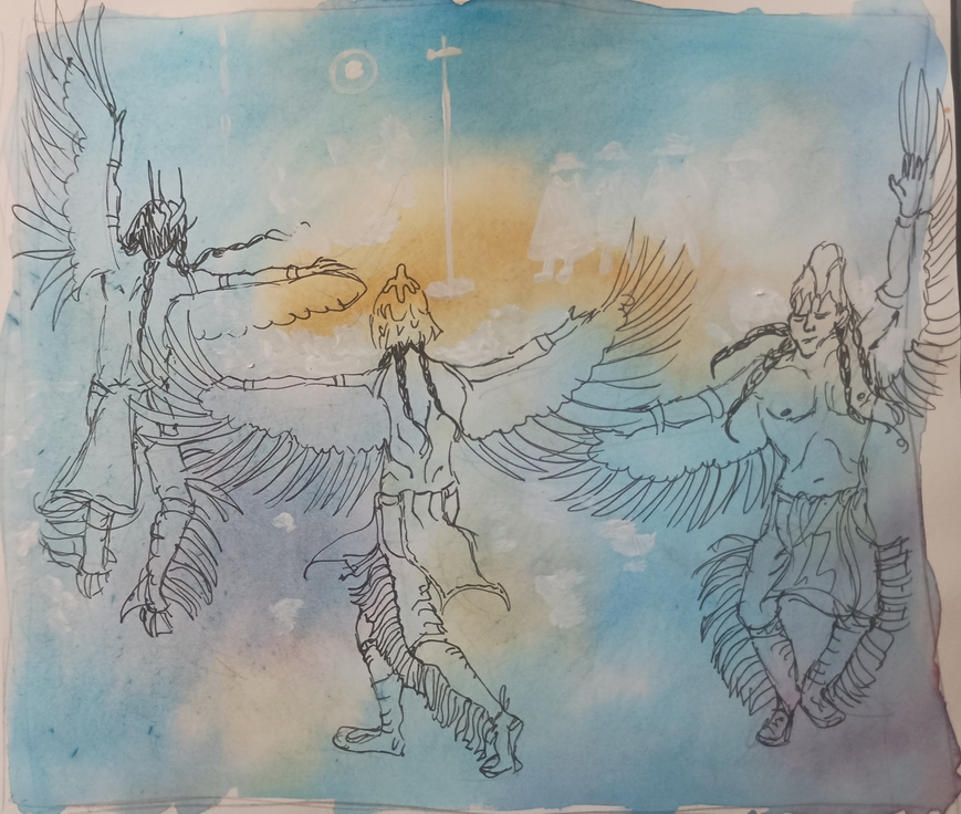
Sketches based on specific artwork
I did a pencil drawing of the artwork and then I did a quick painting of it too to get a rough basis of colours and the inking